AR and the Future of UX Design: A New Frontier

We’re already living in a world where technology bridges the gap between digital and physical realities. From Pokémon Go to IKEA’s furniture placement app, augmented reality (AR) has taken huge strides in blending the virtual and real worlds. But as AR evolves, it’s not just about the fun or convenience anymore—it’s set to become a core part of user experience (UX) design. This shift presents both exciting opportunities and new challenges for designers like me who are looking to stay ahead of the curve.

What is AR?

In case you haven’t fully experienced it yet, augmented reality overlays digital elements—images, text, sounds—on top of the real world. It’s not the fully immersive experience of virtual reality (VR), but rather a layer that adds useful (or entertaining) information to your real-world environment. Imagine looking at a building through your phone’s camera and instantly seeing its history, or trying on clothes in a virtual fitting room before making a purchase.

AR is being used across industries—from retail to real estate and education—and is starting to make its way into more daily interactions, like helping users visualize home renovations, translating signs in real-time, or even navigating through airports with ease. While AR’s potential for enhancing UX is already significant, this is just the beginning.

Why AR Matters for UX

AR is shifting the paradigm of UX from flat screens and menus to a dynamic, interactive environment. This evolution will require UX designers to rethink how users interact with technology and how to design intuitive, functional interfaces that go beyond traditional 2D layouts.

Think about it—AR changes the way users perceive information. Instead of clicking through a series of buttons and scrolling, AR could allow users to physically interact with their surroundings to engage with content. This opens up a whole new world of possibilities for designing immersive experiences that feel more natural, intuitive, and user-centered.

For instance, imagine an AR-powered museum tour where instead of reading text plaques, visitors can point their phones at an artifact and have interactive videos or 3D models appear, bringing history to life. AR can guide the user through their environment in real time, offering contextual information exactly when and where it’s needed.

AR in Retail and Navigation

We’ve seen early AR adopters in retail—brands like IKEA and Sephora have embraced AR as a way to let users visualize products before purchasing. You can now see how that couch will fit in your living room or try out a new lipstick virtually. The beauty of AR in retail is its potential to reduce friction in the buying process, minimizing returns and helping users feel more confident in their purchases.

In navigation, AR is transforming how we get from point A to point B. Google Maps now features an AR mode where digital arrows are overlaid on the street view, showing you exactly which direction to walk. Instead of the cognitive dissonance that comes from switching between a map and the real world, AR allows the two to merge—making navigation feel effortless and more user-friendly.

Challenges in AR UX Design

While the future of AR in UX design is incredibly exciting, it doesn’t come without its challenges. Some of the biggest hurdles UX designers will need to address include:

1. Contextual Awareness

One of the trickiest parts of AR design is creating an experience that enhances the real world rather than distracts from it. Designers must be highly aware of the context in which users are interacting with AR. For example, if you’re designing an AR app for outdoor navigation, you’ll need to consider the brightness of sunlight or the unpredictability of the weather. Similarly, indoor AR experiences must account for factors like lighting, space constraints, and how much information a user can digest without feeling overwhelmed.

2. Physical Interaction

Traditional UX design focuses on digital buttons, links, and swipe gestures. AR, on the other hand, encourages users to physically interact with their surroundings. Designing AR interfaces requires a new mindset. How do users interact with virtual objects in a way that feels natural and intuitive? Gestures, eye-tracking, and even voice commands are becoming more central to the conversation. UX designers will need to think beyond 2D screens and start considering 3D space and the physicality of interactions.

3. Device Limitations

While AR technology is advancing quickly, we still face hardware limitations—battery life, processing power, and user comfort. AR experiences, especially those that involve prolonged use, can drain a device’s battery quickly. Designers will need to find a balance between crafting rich, immersive AR experiences and maintaining efficiency. The key is to design lightweight AR interactions that are meaningful but don’t overwhelm the device or the user.

The Future: AR and Multisensory UX

Looking forward, AR’s future in UX will likely push designers to think beyond visuals. We’re already seeing early integrations of haptic feedback (vibrations) and audio cues, but what happens when the technology evolves to include elements like scent, temperature, or even touch? The potential for creating fully immersive, multisensory experiences opens new doors for UX designers to craft more engaging, memorable experiences.

Imagine walking into a coffee shop and seeing a virtual menu appear on your table, feeling the warmth of a virtual coffee cup, and even getting a hint of the coffee aroma. Or picture an online shopping experience where you can virtually “feel” the fabric of a shirt before purchasing. These future developments will make UX experiences more tactile and connect even more deeply to the user’s senses.

AR UX in Everyday Use

The good news? AR isn’t just about futuristic tech anymore—it’s already starting to become part of our everyday interactions. Companies like Apple and Google have heavily invested in AR development through their ARKit and ARCore platforms, making it easier for designers and developers to experiment with and create AR experiences. Snapchat and Instagram have brought AR into the mainstream with their filters, showing how AR can make even simple interactions more fun and engaging.

One example is Apple’s Measure app, which uses AR to allow users to measure real-world objects simply by pointing their phone at them. This is a perfect illustration of how AR is moving toward utility-driven design, helping users solve real-world problems in an efficient way.

In the education sector, AR is transforming how students learn. Textbooks and apps are beginning to integrate AR to allow students to interact with 3D models of the solar system, dissect virtual frogs, or see historical events unfold before their eyes. It’s an interactive and dynamic way to bring information to life and make learning more engaging.

The Double-Edged Sword: AR in Marketing and Distractions

With the rise of AR, one challenge for UX designers is avoiding information overload or distractions. There’s a risk that users may become overwhelmed if AR is used excessively or inappropriately—leading to cognitive fatigue. Designers need to think critically about where and when to introduce AR elements into the user’s journey, ensuring that these additions enhance rather than clutter the experience.

For instance, while AR ads or product overlays can be highly engaging, they need to be integrated thoughtfully. It’s essential to maintain a balance between immersiveness and usability, ensuring that AR elements don’t detract from the primary goals of the user.

Conclusion: AR as the Future of UX

The future of UX isn’t just about creating smoother digital interfaces—it’s about crafting immersive, real-world interactions that blend seamlessly into the user’s environment. AR is setting the stage for a new kind of user experience, one where users engage with digital content on a whole new level. For UX designers, this means rethinking how we approach design challenges and embracing the evolving nature of user interactions.

As AR technology continues to improve and become more accessible, UX designers will play a crucial role in making these experiences intuitive, helpful, and user-friendly. The key is to balance immersion with simplicity, ensuring that AR enhances the user experience without overwhelming it. It’s a future filled with endless possibilities—and I can’t wait to see how it evolves.

EDC Essentials: My Everyday Carry

Switching things up from my usual design talk today, but in a way, my everyday carry (EDC) is my personal user interface. It’s the gear that helps me navigate daily life, and just like good design, it’s all about functionality and ease. If you’ve heard the catchy song “Phone, Wallet, Keys,” you probably get the gist of keeping your daily essentials simple. My EDC follows a similar approach: it’s all about being prepared for the day ahead. While the basics—phone, wallet, and keys—are the core, I’ve found that adding a few extra tools makes all the difference.

What is EDC, and Why is It Important?

EDC, or everyday carry, is more than just a trendy term for your pocket contents. It’s about having the tools and items you need to handle daily tasks efficiently and to be prepared for unexpected situations. Whether it’s something as small as needing to tighten a screw or as serious as an emergency, having a well-thought-out EDC can make a huge difference in how you navigate your day.

Carrying items like a multitool or a pocket knife doesn’t mean you’re trying to be an outdoor survivalist—it’s about convenience and peace of mind. In my case, each piece of my EDC serves a specific purpose, making me feel ready for whatever comes up.

My Everyday Carry: The Essentials

Let’s start with the basics, the items that I never leave home without:

  • Phone: Obviously, this is at the top of my list. My smartphone is my lifeline for everything—communication, navigation, and even payment.
  • Wallet: Along with the necessary cards and ID, I keep my wallet simple. That said, when space is tight, I might slip a multitool like the Wallet Ninja into it.
  • Keys: You can’t get far without them, right?

These three are non-negotiable, but my EDC doesn’t stop there.

AirPods Pro: Convenience and Connectivity

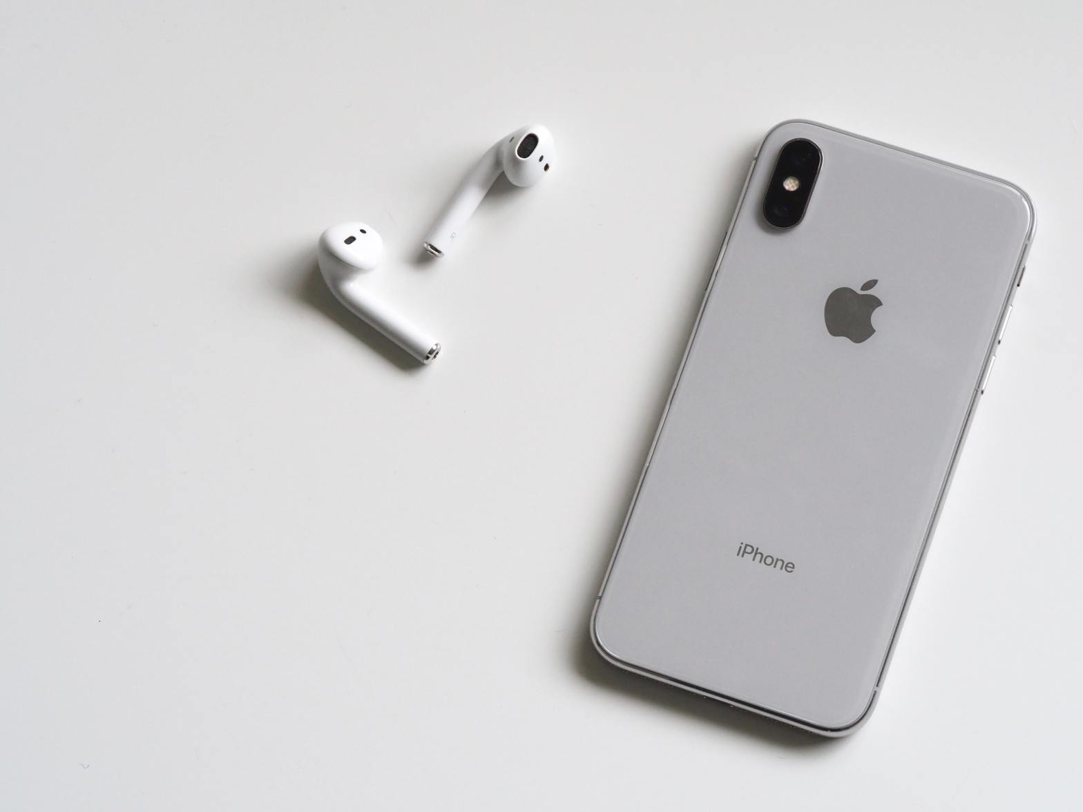
Along with my core essentials, I carry a pair of AirPods Pro. Whether I’m on a long walk, commuting, or just trying to block out background noise to focus, these have become indispensable. They’re small, easy to carry, and offer seamless integration with my phone. Plus, the active noise cancellation and transparency modes make them perfect for switching between isolation and staying aware of my surroundings.

They’ve turned out to be more than just a luxury. Being able to take calls hands-free, tune into a podcast, or even get turn-by-turn directions without staring at my phone makes them a practical addition to my EDC. They streamline my experience and keep me connected without the hassle of cords.

Pocket Knife: Utility and Emergency Preparedness

One of the more utilitarian items I carry is a pocket knife. It’s not something you think of needing every day, but when the moment arises, it’s a game-changer. From opening packages, cutting cords, or slicing up fruit on the go, the pocket knife is my go-to tool for quick fixes. More importantly, it’s also an emergency tool. If I ever find myself in a situation where I need to cut through a seatbelt or handle something critical, having a reliable blade on hand is invaluable.

It’s a small item that packs a big punch in terms of utility. The key is choosing one that’s durable, compact, and legal to carry in most places.

Wallet Ninja: Versatility in Your Wallet

There are times when carrying a knife isn’t practical or even allowed, and that’s when I turn to the Wallet Ninja. This credit-card-sized multitool fits neatly into my wallet and packs a surprising amount of functionality. It’s got everything from a bottle opener and screwdrivers to a ruler and a mini stand for your phone.

The Wallet Ninja is one of those things that seems gimmicky until you need it. I’ve used it to tighten screws, pop open a stubborn soda bottle, and even open packages when my knife wasn’t handy. It’s a handy alternative when you want to keep your carry light and simple but still be prepared for minor tasks throughout the day.

Why EDC Matters

So why take the time to curate an EDC? It’s all about convenience, preparedness, and reducing the amount of stress and hassle in your day-to-day life. Instead of getting caught off guard by small challenges—like not having a way to open a package or deal with an unexpected situation—you’re equipped and ready. It’s a proactive approach to daily life, ensuring that you’re never scrambling to find a solution to a simple problem.

For me, EDC is about more than just having cool gadgets. It’s about being practical and efficient. Each piece I carry serves a purpose, and together, they help me tackle both the routine and the unexpected with ease. There’s a certain peace of mind in knowing that I’m not just winging it day to day—I’m ready for it.

Conclusion

My EDC is a reflection of my mindset: keep it simple, but always be prepared. With items like my phone, wallet, keys, AirPods Pro, pocket knife, and Wallet Ninja, I feel confident that I can handle whatever comes my way, whether it’s a phone call or an emergency situation. It’s not about carrying a lot, but carrying what’s useful and reliable.

What’s in your everyday carry? Maybe it’s time to rethink what you’re packing for the day ahead.

The UX/UI That Keeps Me Hooked: Apple, Waterllama, and Strong

As someone who loves good design, I always appreciate products that combine form and function in a way that makes life easier and more enjoyable. Three apps I use almost every day are Apple’s ecosystem, Waterllama, and Strong. All of them have points in both UX and UI design, but they also have areas where they could improve. Let’s break down why I keep using them daily and what could be better.


Apple: Simplicity Meets Sophistication

When it comes to Apple, its design philosophy has always been about simplicity, elegance, and ease of use. From the moment you unlock your iPhone, you’re greeted with a clean interface that feels intuitive even if you’re using it for the first time. Apple’s UI is minimalist but powerful, with everything you need at your fingertips, whether it’s for productivity, communication, or entertainment. And you know I’m a big fan! (Apple Fanboy, Kind of)

What’s Good:

  • Consistency Across Devices: Whether you’re using an iPhone, iPad, or Mac, the experience feels cohesive. Apple nails it with cross-device integration, allowing you to transition from one device to another seamlessly.
  • Fluid User Experience: The UI is visually appealing with smooth animations, gestures, and a clean design language that is both inviting and efficient.

What’s Not:

  • Customization Limitations: Apple’s tight control over the user interface means you can’t customize your device much, unlike Android. While that contributes to its uniform experience, some users may find it restrictive. Even with the iOS 18 update, it’s still not nearly as customizable.
  • Overload of Features: Apple’s settings menus can be a bit overwhelming for first-time users or those who don’t need all the advanced features. Even as someone who uses Apple every day, it’s easy to get lost in endless settings and toggles.

Waterllama: Hydration with Personality

Waterllama is one of those apps that adds fun to the mundane task of staying hydrated. With its whimsical characters and colorful interface, Waterllama motivates you to drink water throughout the day, turning what could be a dull health chore into a playful experience.

What’s Good:

  • Engaging UI: The playful characters and visuals make it exciting to track your water intake. It’s a great example of gamification done right in UX, making something as routine as drinking water feel like an achievement.
  • Ease of Use: The app’s simple layout and visual cues make tracking easy, even when you’re on the go. There’s no steep learning curve; you open the app, log your drink, and that’s it!

What’s Not:

  • Customization Limits: While the design is fun, the app could benefit from more options for customization, like setting different hydration goals based on more specific health needs. It’s also very character-driven, which might not appeal to everyone.
  • Limited Tracking Options: Waterllama focuses almost entirely on hydration. Adding more health and wellness metrics could make the app more comprehensive without losing its playful design.

Strong: Fitness Meets Functionality

Strong is my go-to fitness app, particularly for weightlifting and strength training. Its UI is designed for efficiency, and the app’s ability to store workout data and help you plan routines makes it invaluable for anyone serious about their fitness.

What’s Good:

  • Streamlined UI: The app’s minimalistic design is functional and uncluttered, allowing users to log workouts quickly and efficiently. This is crucial when you’re at the gym and want to focus on lifting, not messing with your phone.
  • Detailed Tracking: Strong provides detailed progress tracking and analytics, giving you clear insights into your fitness journey. The ability to easily compare past performance and set goals enhances the user experience significantly.

What’s Not:

  • Learning Curve: For beginners, the app can feel a bit complex. It’s built for people who already know their way around a gym, so first-time users might need some time to get comfortable with all the features.
  • Aesthetic Design: While the UI is functional, it could use a little more personality. It’s very straightforward, but it lacks the engaging visual elements that make apps like Waterllama fun to use. A slight redesign could make it feel more approachable without sacrificing functionality.

Conclusion

Each of these apps—Apple, Waterllama, and Strong—has found a spot in my daily routine thanks to their strong UX and UI designs. Apple’s seamless integration across devices keeps me in its ecosystem, Waterllama turns hydration tracking into a fun task, and Strong makes fitness tracking efficient and insightful. However, even the best apps have room for improvement. Whether it’s adding customization options, simplifying interfaces, or enhancing visual appeal, there’s always something that could be fine-tuned.

Design isn’t just about how something looks, but how it works—and these apps, despite their flaws, definitely work for me.

Design in Everyday Life

Hey everyone! I’m stepping out of my usual UX-focused content to talk about something a little different today. This post is a passion piece about design—specifically, the designs I love in everyday life. From travel gear to shoes to architecture, these are the things that inspire me and make life just a bit more enjoyable.


I Love to Travel

Let’s start with something close to my heart—travel. Anyone who knows me knows that I’m always on the lookout for gear that not only looks good but also serves a purpose. My go-to for long weekend trips is the Topo Designs 30L Travel Backpack in Olive. This bag is a game-changer, and here’s why.

First off, the size is just right. At 30 liters, it’s spacious enough to fit everything I need for a 3-4 day trip without being bulky or cumbersome. The design is incredibly thoughtful; it’s got a clamshell opening that lets you pack it like a suitcase, so no more digging around trying to find that one item buried at the bottom. Inside, there are multiple compartments for organization—a padded laptop sleeve, mesh pockets for smaller items, and even a dedicated shoe compartment. It’s like the designers knew exactly what a traveler would need.

But what really sets the Topo Designs backpack apart for me is the durability and sustainability. The bag is made from 1000D nylon, which is tough enough to withstand rough handling but still looks sleek and stylish. And since sustainability is something I care about, I love that Topo Designs focuses on creating products that last, reducing the need for frequent replacements.

Now, let’s talk about Cotopaxi. I haven’t added one of their bags to my collection yet, but it’s only a matter of time. Cotopaxi is another brand that nails the combination of design, functionality, and ethics. They’re known for their vibrant colors and distinctive designs, but there’s more to it than just aesthetics. Cotopaxi is a certified B Corp, meaning they meet high standards for social and environmental performance. Their bags are made from repurposed materials, so each one is unique and has its own story.

One of the things I admire about Cotopaxi is how they take care of their employees and give back to communities. When you buy a Cotopaxi product, you’re not just getting a bag; you’re supporting a company that’s doing good in the world. Plus, their bags are designed to be highly functional, with plenty of pockets and compartments to keep everything organized. It’s just a matter of time before one of these finds its way into my travel rotation.


Good Design for Shoes

Next up—shoes. You can tell a lot about a person by their shoes, and I’m all about finding that perfect balance between style and comfort. Let’s start with Nike. Now, Nike is a brand that hardly needs an introduction. They’ve mastered the art of combining form and function in a way that feels effortless.

One of my go-to pairs is the Nike Air Force 1’s in White. It’s a classic that’s been around since 1982, and for good reason. The design is timeless, with clean lines and a simple yet iconic silhouette. The all-white colorway goes with just about anything, making it a versatile choice for everyday wear. But it’s not just about looks—the Air Force 1’s are also incredibly comfortable, thanks to the cushioned midsole that provides support with every step. It’s the kind of shoe that you can wear all day and still feel good in, whether you’re walking around the city or just hanging out.

Moving on to New Balance—if comfort had a brand, it would be this one. New Balance shoes are known for their superior comfort and support, which is why they’ve earned a spot in the rotation. I’m particularly fond of the New Balance 237s. This shoe is a modern take on the brand’s retro running shoes, combining a sleek, minimalist design with the comfort and quality you’d expect from New Balance. The 237s have a lightweight feel with a cushioned insole that makes them perfect for all-day wear. The combination of suede and mesh in the upper gives it a vintage vibe, while the oversized N logo adds a bold touch. It’s a shoe that’s as comfortable as it is stylish, and it’s quickly become a favorite in my collection.

Then there’s OnCloud—a brand that’s all about that “walking on clouds” experience. The OnCloud Cloudflow is my favorite from their lineup. It’s incredibly lightweight, with a unique sole design that provides a soft landing with every step. What I love about OnCloud is their commitment to innovation. Their shoes are built with performance in mind, but they don’t sacrifice style to get there. The result is a shoe that’s as functional as it is visually appealing.

Architecture

Finally, let’s talk about architecture. This might seem like a big leap from travel gear and shoes, but hear me out—architecture is design on a grand scale. It’s all around us, shaping our experiences in ways we might not even realize.

One of the architectural marvels that I find particularly fascinating is the Lotus Temple in India. Located in New Delhi, this Bahá’í House of Worship is not only a place of spiritual significance but also an architectural masterpiece. The temple’s design is inspired by the lotus flower, a symbol of peace and purity in Indian culture. Its 27 free-standing marble-clad “petals” form nine sides, creating a stunningly symmetrical structure that looks like it’s floating above the surrounding landscape. What I love about the Lotus Temple is how it combines simplicity with elegance—there’s no ornate decoration, yet the structure feels majestic. The use of natural light filtering through the petals creates a serene atmosphere inside, making it a perfect example of how architecture can influence our emotional experience.

Another favorite of mine is Le Mont-Saint-Michel in France. This island commune is crowned by a stunning abbey that seems to rise organically from the rocky mount. The winding streets and steep staircases lead you through a labyrinth of medieval architecture that feels almost otherworldly. What makes Le Mont-Saint-Michel so remarkable is its integration with the natural landscape—it’s as if the abbey and the rock are one. The way the structure blends with its surroundings, coupled with the ever-changing tides, creates a dynamic visual experience that changes depending on the time of day and the season. It’s a powerful reminder of how architecture can harmonize with nature, creating something truly timeless.

Lastly, I have to mention the Starfield Library in Seoul, South Korea. Situated within the COEX Mall, this library is a stunning example of interior design. The first thing that strikes you is the sheer scale of the space—the ceilings soar high above, and the bookshelves stretch from floor to ceiling, creating an awe-inspiring wall of books. The design is modern, with clean lines and a minimalist aesthetic, yet it feels warm and inviting. The way the space is organized encourages exploration, with cozy reading nooks and open areas for gathering. The Starfield Library is a perfect blend of form and function—it’s a place where people can come together to read, study, and relax, all while being surrounded by the beauty of well-thought-out design.

Thanks for taking this journey with me through some of my favorite designs in everyday life. Whether it’s a backpack, a pair of shoes, or a building, design plays a crucial role in our daily experiences, often in ways we might not even realize. Good design isn’t just about aesthetics; it’s about how things work, how they’re made, and how they make us feel.

Stay tuned for more on design—from the everyday to the extraordinary!

UX Writing vs. Researching vs. Designing: What’s the Difference?

Hey everyone! Today, I want to dive into the fascinating world of UX and explore the different roles within it: UX writing, researching, and designing. If you’ve ever wondered what sets these roles apart and how they work together, this post is for you. Let’s break it down step by step.

Similarities and Differences

First, let’s talk about what these roles have in common and how they differ.

Similarities:

  1. User-Centered Focus: All three roles prioritize the user’s needs and experiences. Whether you’re writing microcopy, conducting user interviews, or designing interfaces, the goal is to create a product that users love.
  2. Collaboration: UX writing, researching, and designing often require working closely with other team members, including developers, product managers, and stakeholders. Collaboration is key to creating cohesive and effective user experiences.
  3. Iterative Process: Each role involves an iterative process of testing, feedback, and refinement. This means continuously improving the product based on user feedback and data.

Differences:

  1. UX Writing: UX writers craft the text that appears throughout a product. This includes everything from button labels to error messages to onboarding instructions. Their goal is to communicate clearly and effectively, guiding users through the product.
  2. UX Researching: UX researchers focus on understanding the users. They conduct interviews, surveys, and usability tests to gather insights into user behaviors, needs, and pain points. This research informs the design and development process.
  3. UX Designing: UX designers create the visual and interactive elements of a product. They design wireframes, prototypes, and final interfaces, ensuring that the product is both aesthetically pleasing and functional.

Pros and Cons

Now, let’s look at the pros and cons of each role.

UX Writing:

Pros:

  • Clarity: UX writers have a knack for making complex information simple and accessible.
  • Impact: The right words can significantly enhance the user experience.
  • Creativity: Crafting engaging and concise copy requires a good deal of creativity.

Cons:

  • Limited Visibility: UX writers’ contributions might not be as visible as design elements.
  • Challenges in Measurement: It can be difficult to measure the impact of UX writing quantitatively.

UX Researching:

Pros:

  • User Insights: Researchers gain a deep understanding of user needs and behaviors.
  • Data-Driven Decisions: Research findings provide a solid foundation for design and development decisions.
  • Problem-Solving: Researchers enjoy solving complex user problems.

Cons:

  • Time-Consuming: Conducting thorough research can be time-consuming.
  • Recruitment Challenges: Finding and recruiting participants for studies can be difficult.

UX Designing:

Pros:

  • Visual Creativity: Designers get to flex their creative muscles and create visually appealing products.
  • High Impact: Design is often the most visible aspect of a product and has a significant impact on user experience.
  • Innovation: Designers can push the boundaries of what’s possible in user interfaces.

Cons:

  • Feedback Overload: Designers often receive a lot of feedback, which can be overwhelming.
  • Balancing Aesthetics and Functionality: Ensuring that a design is both beautiful and functional can be challenging.

Wearing Multiple Hats

In many roles, especially in smaller companies or startups, people find themselves wearing multiple hats. You might be a UX designer who also conducts user research and writes microcopy, or a UX writer who also dabbles in design. This versatility can be both rewarding and challenging.

Pros:

  • Holistic Understanding: Handling multiple roles gives you a broader perspective on the product and its users.
  • Skill Development: You’ll develop a diverse skill set that can make you more adaptable and valuable to employers.
  • Flexibility: Being able to switch between tasks can keep your workday interesting and varied.

Cons:

  • Time Management: Balancing multiple roles can be time-consuming and stressful.
  • Depth vs. Breadth: You might not have the time to dive deeply into each area, which can affect the quality of your work.

Which Role is Right for You?

So, which role is the best fit for you? Here are a few things to consider:

  1. Passion for Words: If you love crafting clear, concise, and engaging copy, UX writing is your calling.
  2. Curiosity About Users: If you’re fascinated by user behaviors and enjoy gathering and analyzing data, UX researching could be a great fit.
  3. Visual Creativity: If you have a passion for design and love creating visually stunning and functional interfaces, UX designing is likely the way to go.
  4. Versatility: If you enjoy wearing multiple hats and have a broad range of interests, you will thrive in a role that combines aspects of writing, researching, and designing.

Ultimately, the best role for you will align with your skills, interests, and career goals. Each role has its own unique challenges and rewards, and finding the right fit is all about understanding what makes you tick.

Figma Slides for Beginners: A Comprehensive Guide

Hey everyone! Today, I want to dive into something that’s been a game-changer for me and many other designers: Figma Slides. If you’re new to Figma or just looking for a better way to create stunning presentations, you’re in the right place. Let’s break it down step by step.

What Are Figma Slides?

Figma Slides are essentially presentation slides that you can create directly within Figma. Unlike traditional presentation tools like PowerPoint or Google Slides, Figma Slides bring the power of Figma’s design capabilities to your presentations. This means you can leverage all the awesome design tools Figma offers while crafting your slides.

Why Use Figma Slides?

  1. Seamless Design Integration: If you’re already using Figma for your design projects, integrating your presentations into the same workflow is a no-brainer. You can easily pull in design assets, components, and styles from your other Figma files.
  2. Collaboration: Figma is known for its real-time collaboration features, and Figma Slides are no different. Multiple team members can work on the presentation simultaneously, making it perfect for team projects.
  3. Consistency: By using Figma, you ensure consistency across your design and presentation work. You can maintain the same styles, fonts, and components, giving your slides a professional and cohesive look.

Getting Started with Figma Slides

  1. Create a New File: Start by creating a new file in Figma. You can choose a custom size for your slides or use the standard 16:9 ratio. To do this, simply create a new frame and set the dimensions to 1920×1080 pixels.
  2. Design Your Slides: Use Figma’s robust design tools to create your slides. You can add text, images, shapes, and components just like you would in any other Figma project. Remember to make use of Figma’s grid and alignment tools to keep everything neat and tidy.
  3. Use Components: Components are a lifesaver when it comes to maintaining consistency. Create components for common slide elements like headers, footers, and buttons. This way, you can easily update them across all your slides if needed.
  4. Animate Your Slides: Figma also supports basic animations and transitions. Use the prototype mode to add interactions between your slides. This can make your presentation more dynamic and engaging.

The Downside: Lack of Templates

Now, let’s talk about one of the drawbacks of using Figma Slides: the lack of templates and template customization. Since Figma is relatively new to the presentation game, there aren’t as many pre-made templates available compared to more established tools like PowerPoint or Google Slides.

Why This Matters:

  1. Time-Consuming: Without ready-made templates, creating slides from scratch can be time-consuming, especially if you’re in a rush or not as confident in your design skills.
  2. Customization Limits: While you can create your own templates, the customization options are still somewhat limited compared to dedicated presentation software. This can be a bit frustrating if you’re used to having a wide variety of templates at your disposal.

Workarounds:

  1. Create Your Own Templates: Spend some time creating a set of templates that you can reuse. Once you’ve done this, you’ll save time on future presentations. Consider making templates for different types of slides, like title slides, content slides, and summary slides.
  2. Use Community Resources: The Figma community is pretty active, and you can find user-generated templates and resources online. While they may not be as abundant as in other tools, they’re definitely worth checking out.
  3. Combine Tools: If you really need a specific template, you can always design it in another tool and import it into Figma as an image. This way, you get the best of both worlds—Figma’s design power and the template variety of other software.

Final Thoughts

Figma Slides are a powerful tool for anyone who wants to create beautiful, consistent, and collaborative presentations. While the lack of templates can be a drawback, the benefits far outweigh this minor inconvenience. With a bit of creativity and some time investment upfront, you can create your own set of templates and streamline your presentation process.

So, give Figma Slides a try and see how it can transform the way you create and share presentations. Happy designing!

Let’s talk Accessibility

Yep, that’s right, I’m talking about the extra see-through home button on the corner of your mom’s iPhone (not a swipe, just the truth). Accessibility is a big part of a lot of lives, whether that be as simple as haptic feedback to let you know a transaction occurred, or as complex as changing your earbuds to act as a hearing aid. And one thing’s for sure, everyone uses some facet of it and that’s why I think it’s especially important for UX/UI Designers to incorporate that in every design.

So, what is accessibility? It’s a concept of whether or not a product/service can be used by everyone-regardless of how they approach it. For example, a crosswalk has a few indicators of crossing: the red hand changes to a walking person, ridges on the floor to show when you’ve reached. Besides roads, we see accessibility in products we use daily as well. You’re probably reading this on your smartphone right now, and have the text set on larger or smaller font to help your eyes adjust. You might have night light turned on your device in the evening to improve your sleep.

Now there’s good accessibility but also bad ones. It’s important to know which is which, and also to learn from it, so you iterate a better design your next go-through. Now for me personally, I’ve got big hands, so any app that has tiny buttons (looking at you Soundcloud) for use on a key feature, I take issue with. Streaming sites auto-playing previews when you’re not moving your mouse or hovering over them.

And there’s also half-and-half. Apple has high efficiency storage on its image libraries, but if you’re running low on space, and decide to take a video, it may pause in the middle of your moment, and you lose the recording altogether. Ticketing apps let you purchase multiple seats and let you add to the ones you’ve already bought, but say someone in your party can’t attend. Those same ticketing apps won’t let you sell just 1 of the 5 tickets, you’d have to sell them all and risk losing out.

Why Accessibility Matters in UX/UI Design

Accessibility isn’t just about making sure that people with disabilities can use your product—it’s about creating a better experience for everyone. When we design with accessibility in mind, we make our products more flexible, adaptable, and ultimately, more usable. For instance, captions on videos are essential for people with hearing impairments, but they also benefit people in noisy environments or those who prefer reading to listening.

Consider the principle of “universal design,” which aims to create products and environments that are usable by all people, to the greatest extent possible, without the need for adaptation or specialized design. This principle can be applied in countless ways in UX/UI design. For example, adjustable text sizes not only help those with visual impairments but also improve readability for everyone. Similarly, voice-activated controls can be a game-changer for users with mobility issues, while also providing convenience to all users.

Real-World Examples of Accessibility in Action

One real-world example of excellent accessibility design is the Xbox Adaptive Controller, which Microsoft developed for gamers with limited mobility. This controller features large programmable buttons and can be connected to a variety of external devices to suit different needs. It’s a brilliant example of how thoughtful design can make gaming accessible to a wider audience, enhancing the user experience for everyone involved.

Another example is Google’s suite of accessibility features in their products. From voice typing in Google Docs to customizable keyboard shortcuts in Gmail, these features are designed to help people with a range of disabilities. But they also enhance productivity for all users by providing more ways to interact with the software.

How to Incorporate Accessibility in Your Designs

Incorporating accessibility into your designs doesn’t have to be daunting. Here are some practical steps you can take:

  1. Start with Empathy: Understand the diverse needs of your users. Conduct user research that includes people with different disabilities and gather insights into their experiences and challenges.
  2. Follow Accessibility Guidelines: Familiarize yourself with guidelines such as the Web Content Accessibility Guidelines (WCAG). These provide a comprehensive set of standards to help you make your designs more accessible.
  3. Use Accessible Design Tools: Tools like Figma and Sketch offer features that help designers create accessible interfaces. For instance, they provide color contrast checkers to ensure your text is readable against different background colors.
  4. Test with Real Users: Conduct usability testing with people who have disabilities. This will give you valuable feedback on how well your design works for them and highlight areas for improvement.
  5. Iterate and Improve: Accessibility is an ongoing process. Regularly review and update your designs to incorporate new accessibility features and address any issues that arise.

The Future of Accessibility in UX/UI Design

As technology continues to evolve, so too does the potential for accessibility in UX/UI design. Emerging technologies like artificial intelligence and augmented reality offer exciting new possibilities for making products more inclusive. For instance, AI-powered tools can provide real-time transcription for people with hearing impairments, while AR can create immersive experiences for people with visual impairments.

Incorporating these technologies into our designs will not only help us create more accessible products but also push the boundaries of what’s possible in UX/UI design. As designers, it’s our responsibility to stay informed about these advancements and explore how they can be used to enhance accessibility.

Conclusion

In conclusion, accessibility is a crucial aspect of UX/UI design that benefits everyone. By prioritizing accessibility, we can create products that are more usable, flexible, and enjoyable for all users. Whether it’s through simple adjustments like larger text sizes or more complex solutions like adaptive controllers, there are countless ways to make our designs more inclusive. As technology continues to advance, the opportunities for accessible design will only grow, offering exciting new possibilities for creating a more inclusive world.

Thanks for reading, and stay tuned for more updates on my journey in the world of UX and UI Design!

UX Design and Me

Wow, it’s been a while since I posted! Just been busy trying to learn how to be a good UX Designer (which has a lot to do with UI too, but we’ll get there). Since last year, I’ve been trying to transition into a full-time UX career, working on custom products on app and web. I’m excited to share all of this with y’all!

So what the heck is UX and UI Design? UX stands for user experience and UI stands for user interface. When you use an app, UX is how you feel when you use the app and UI is overall how the app looks. And that’s all you really need to know. And also Figma. And maybe typography. And hierarchy. And how all of that fits together. Easy right?

Of course, knowing how to effectively use each element is key, but in my experience, I’ve found that being able to transform an app or site is what really makes products stand out. The main thing you should be able to do is try and fail. What I mean is that you’re never gonna get the idea in your head right on paper the first time. You’re not that guy/gal pal. Doesn’t just apply to UX design but a lesson learned nevertheless.

Now giving a blanket statement isn’t really saying anything so I’ll let you in on one of the designs I made to understand why I think I’m the right fit for UX and vice-versa. Here’s the before of the website torontocupcake.com, a bakery in Toronto.

Now I ran through a few drafts of what I wanted the redesign to be and landed on this. 3 hours before our family’s Super Bowl Party (Go Chiefs!). So a bit rushed, to say the least.

Now this looks ok, for 3 hours of work. But this isn’t high school and design work is expected to be clean, crisp, and professional. So, I re-did the design over 3 days instead, and made it like so.

Quite a bit better than from where we started right? So how’d we get here? Well, I started by looking at the original site in its entirety, navigating each page and seeing how many clicks it would take for me to checkout. I did some mock-ups for how it would feel on draft 1 and how it might be on the final product as well. Then I followed up with some research on other major bakeries (Nothing Bundt Cakes, Sprinkles, etc.) and looked into how their site looked and felt. Then I made some wireframes and prototypes for how I wanted the new site to look and feel.

Now, this may seem intimidating at first, but honestly, that’s like a lil sprinkle of what I had to do. You’ve got to do user research as well, see what people are looking for when they purchase cupcakes, and keep on redesigning until you get to THE ONE. The one design that will push the product forward.

The redesign process was iterative, with plenty of testing and tweaking along the way. I used Figma to create interactive prototypes and gather feedback from stakeholders and users. Typography and color choices were carefully considered to align with the brand’s identity while enhancing readability and visual appeal.

In the end, the revamped Toronto Cupcake website received positive feedback from both stakeholders and users. The new design not only looked great but also significantly improved the user experience. It was incredibly rewarding to see my hard work pay off and make a real impact, even if it was just a mock project.

This project reinforced the importance of user-centered design and the value of continuous iteration. It was a perfect example of how UX and UI work hand-in-hand to create products that are not only beautiful but also functional and enjoyable to use. I can’t wait to take on more projects like this and continue growing as a UX Designer.

Another reason why UX design is such a great fit for me is that it allows me to combine my creative skills with problem-solving. As a creative person, I’ve always been drawn to activities that let me express myself. UX design taps into that creative passion by allowing me to envision and create beautiful interfaces and experiences, especially ones that are accessible to all.

As I continue on this journey, I’m constantly reminded of why I chose this path. The blend of creativity and logic keeps me motivated and excited for what’s to come. There’s always something new to learn, a new challenge to tackle, and another opportunity to make a difference through design.

Thanks for reading, and stay tuned for more updates on my journey in the world of UX and UI Design!

Intro and Expectations

This is a long WIP. This will change with new experiences and periodically update. Stay tuned!

Hey! Looks like you’ve stumbled onto my blog, MinimalTechie! This blog is all about the tech I love, their design, and how I might use them in my day to day. The minimal part stems from my love of minimalism and my slow transition to that lifestyle.

Why’d I start this blog?

  • It was created in part to showcase my interest in new tech, but it also serves as my first on-going project/portfolio
  • In the (FAR) future, I want to become a UX director, and this is my first major step to that goal

Here’s a short About Me:

  • I’m an Austinite so stay weird y’all! I’ve got a BBA and a few certifications which you can view in my portfolio and resume.
  • In my spare time, I like getting nipped by my 3 year old (Labrador), build plastic robots (Gundam), and gaming with my friends.

What Content to Expect:

Technology! Minimalism! All of the above! But seriously, you get:

  • Perspective Essentially my opinion on select products and how they’ve helped me
  • Tech Obviously in the name, so I will be talking about technology, but sometimes in the industry sense or the design sense
  • Connect with Me If you find any of the content helped you, or you want to reach out, find me on LinkedIn

This is again, just the start of the blog, and will evolve as time goes on. Send me your opinions on tech-related stuff you want to see, if any, and have an awesome day because YOU. ARE. AWESOME.

#zerotohero #firstpost #intro #minimaltechie

Apple Fanboy, Kind Of

Confession time. I love Apple. That’s not anything new that anyone has said so why the dramatic title? Well, I wanted to start this blog with passion, and I couldn’t think of anything that I am more passionate about (as I say, typing on my homemade PC).

If you ask anyone in my tiny circle, they will refer to me when it comes to technology of any kind. You know, the nerd of the group. My refer-ability has even more power when it comes to the latest and greatest Apple products since I have experienced all of their products some way or the other.

On top of that, Apple products are aesthetic and can be good furniture pieces. But no one spends $12,000 on a Mac Pro (the Apple cheese grater) and its $5,000 display (not sponsored) to just show off. They are apt at minimalism while having the functions that consistently make them one of the top brands year after year.

To help you understand just how “obsessed” I am, here are the products I have owned/currently own:

  • iPhone 3GS, 4S, 5S, 7, X, 12 Pro, 14 Pro
  • iPad mini, iPad 9th Gen, iPad Air 4
  • Apple Watch Series 0 (original), 4, 7
  • MacBook Pro
  • AirPods Pro 1, AirPods Pro 2

Not a lot, but I still live like a student so I definitely am unable to buy a new iPhone year after year, but I can honestly say that every version I have owned has been better than most. My iPhone X (ten) was better then every phone released post until the iPhone 12 Pro, according to myself, Business Insider, and DigitalTrends. However, The 12 Pro was not “earth-shattering” compared to the much better camera and features of the 14 Pro, what with its 48mp camera which is comparable to the modern Asian smartphones (I’m not counting the Xiaomi phones, which have a whopping 200mp!)

Now this blog doesn’t exist just for me to tell you about new Apple products, that’s just one of the many things I’m excited to write about. Besides that, I want to talk about design, specifically UX Design, which is the field I am transitioning to. Apple is just one example of great design as well as a great user experience (UX). Facetime is the most synonymous way to say “video-call” and is used by grandparents everywhere. The simple UI (user interface) with minimal controls makes it easy to use, accessible, and has a great design, the key steps in any great user experience. It is just one company of many that makes for an excellent UX

I hope this first blog gives you an idea of what’s to come, and I look forward to hearing your comments below!

#apple #uxdesign #minimaltechie